
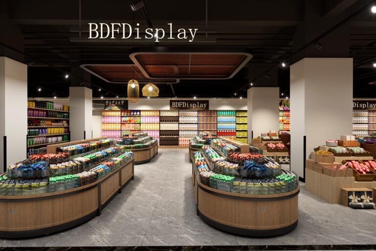
1500㎡ Large Lifestyle Grocery Store Design & Free 3D Layout
large grocery supermarket layout, daily goods retail store design, heavy-duty supermarket shelving, full-category lifestyle store planning
🌐 China Factory × Global Service | Custom Display Cabinets & Store Furniture for Retail Brands

Supermarket design isn’t just renovation; it’s about understanding customer behavior. What shoppers see when they enter, how they find products, where impulse buys happen, how promotions stand out, and how seasonal themes and digital tools keep the store fresh—all of these directly influence sales and customer satisfaction.
This “Creative Design Guide for Retail Supermarkets” combines “Visual Merchandising + Display Solutions + Digital Signage + Data-Driven Operations” to break down a practical creative design framework. It’ll help you turn your supermarket into a place that’s “more fun to browse, easier to shop, and worth visiting again and again.”
Many stores think “creative design” is just putting up a few nice product stacks, hanging some light strips, or pasting posters. But truly effective supermarket creative design needs to solve at least four core problems at the same time:
Use these four points as your “design acceptance criteria,” and you’ll naturally eliminate many “pretty but useless” plans. The best creative designs that boost sales are always “aesthetic + operable + replicable.”
A supermarket’s layout is essentially about designing customers’ walking routes and how they allocate their attention. A good layout lets customers easily finish their shopping lists while exposing them to more “unplanned but logical” products without being intrusive.
A common strategy is to place high-frequency, essential items like milk, eggs, and bread in the back of the store. To get these, customers have to walk past more categories, creating more opportunities for additional purchases. This method has been proven effective in many supermarkets, especially for stores looking to increase overall average transaction value.
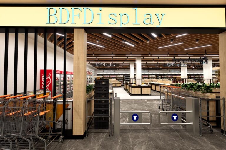
The entrance determines whether customers are willing to slow down and start browsing. Focus on placing:
The entrance’s success isn’t about having lots of information—it’s about “being easy to understand and making you want to browse at a glance.”
Avoid narrow aisles or cluttered corners that cause congestion. If customers feel cramped or confused, they’ll be more likely to “hurry through their list and leave” instead of exploring. Wide aisles, clear zoning, and predictable traffic flow are the foundation for increasing stay time.
Product display isn’t just about tidiness—it’s about guiding customer decisions through “levels, density, focal points, and contrast.” These methods are especially crucial for supermarkets:
The area from eye level to arm’s reach is the most noticeable. Allocate it based on your business goals:
This isn’t an aesthetic choice—it’s a business decision about “allocating shelf resources.”
“Pyramid-style” displays (wider at the bottom, narrower at the top) are visually stable and make it easier for customers to scan the entire shelf. They work especially well for grouped products, gift boxes, cases of drinks, and fruit/vegetable stacks.
Overstocking creates a sense of oppression and increases the risk of spoilage (especially for fruits, vegetables, and bread). Instead, increase restocking frequency to keep displays neat and “just adequately full.” For perishable items, frequent organizing and FIFO (First In, First Out) are key to balancing operations and visuals.
The most “sales-driving” areas in a supermarket aren’t usually regular shelves—they’re the displays that change customers’ walking pace and “pop up” in their line of sight.
Endcaps are highly visible when customers enter an aisle, making them perfect for impulse buys. Recommendations:
Endcaps aren’t just “piles of cheap goods”—they’re about “pulling customers in with a strong focal point.”
Promotional islands work best in high-traffic areas like main aisles or intersections. Key points:
Dump bins excel at “casualness + low decision cost,” making them ideal for clearance, limited-time promotions, irregularly shaped packages, or small items. Common placement:
But note: Dump bins can easily look cheap and messy. The key is choosing the right categories and adding clear top signs—let customers know these are “special price/limited time/selected items,” not “unsold goods.”
The guide mentions “varying heights” to boost visual appeal. You can use:
Changing heights essentially makes customers pause and think “let me check this out.”
Many supermarkets place produce at the entrance because fruits and vegetables naturally have the advantage of “color, texture, and smell,” quickly establishing a first impression of “freshness, health, and trustworthiness.” To create a “market feel” for your produce section, focus on these areas:
For example, clearly separate leafy greens, root vegetables, mushrooms, salad ingredients, and herbs with prominent signs. Mixing them up just makes customers feel “it’s too messy to pick through.”
Seasonal displays (pumpkin season, strawberry season, summer berries, New Year’s oranges) aren’t just more effective for promotions—they’re also great for social media sharing. The key to theme tables isn’t lots of decorations, but strong theme symbols + concentrated products + easy-to-understand information.
Add these to the produce section:
When customers “aren’t sure how to use it,” they’re likely to skip the purchase. Educational information significantly reduces this abandonment rate.
Bakery and deli sections are “high-sensory, high-margin, and high-impulse” areas in supermarkets. The design focus is: let customers see it, smell it, and take it easily.
Use food display cases, layered shelves, and acrylic risers to make products more three-dimensional and visible. Keep lighting bright and countertops clean—this is part of “building trust in the purchase.”
Double-sided bread display tables increase touchpoints in limited space. They’re perfect for high-traffic areas, improving accessibility and creating a “small island” to enhance visibility.
Cross-category pairing is a classic strategy to increase average transaction value: let customers grab an extra item without thinking. The same applies to delis: place drinks, desserts, and side dishes next to main courses to boost additional purchases.
Nearly every customer passes through the checkout area, making it the most consistent traffic spot in the supermarket. The design strategy is clear: let customers “grab extra items” during their waiting time.
Examples include acrylic dump bins, countertop small shelves, and vertical hangers. The key is: don’t block traffic, be within easy reach, and have clear information.
When customers “can’t find something” in a large supermarket, there are two losses:
Key points: Large fonts, high contrast, and consistent categorization logic. Aisle signs should be visible from a distance to avoid customers walking down the wrong aisle.
Digital wayfinding’s value lies in:
For supermarkets that frequently run promotions, adjust displays, or do seasonal rearrangements, digital wayfinding is easier and less error-prone than “reprinting a bunch of signs.”
Digital signage in supermarkets isn’t just “replacing posters with screens”—it’s turning in-store information into a content system that’s programmable, real-time updatable, and data-linked. The guide emphasizes that it boosts customer engagement, drives impulse buys, improves navigation, and enables continuous optimization through real-time updates and data analysis.
Core principle: Display relevant information “at the moment customers make decisions.”
Recipe content is great for guiding “additional purchases”: for example, a screen showing a pasta recipe can remind customers that noodles, sauce, and spices are available in the next aisle. Customers can gather all ingredients for a meal without extra effort, leading to a better experience and more purchases.
One of the key benefits of digital screens and electronic shelf labels (ESL) is real-time updates: when you need to adjust promotions, manage inventory changes, or announce restocks, information can be synced to the store instantly—no more waiting for staff to change tags, misprinted prices, or outdated posters. This consistency and efficiency are especially crucial for multi-store chains.
Electronic shelf labels enable dynamic pricing and real-time updates, reducing paper waste and human error from manual price changes. More importantly, they support flexible promotion strategies:
When you combine ESL with digital signage, you create a “unified real-time information system” in the store: prices, promotions, and content are no longer disconnected.
For example, place touchscreens or smart query points in the condiment, alcohol, and skincare sections to give customers “reasons to choose” and reduce decision fatigue:
The design principle for interactive content is “short, fast, and actionable”: avoid long articles; break information into 3-5 key points so customers can make decisions on the spot.
Digital signage can display social media feeds, customer posts, and selected reviews—”user-generated content (UGC)”. Its value lies in natural social proof:
Place UGC in high-traffic areas (entrance, near endcaps, checkout queues) and keep the layout clean: large images + one short review + clear product/price information to avoid information overload.
One of the most underrated design strategies in supermarkets is treating “a customer’s meal” as the design unit, rather than “a single category.”
Display complementary products together—this classic method boosts attachment rates. For example:
Key point: Combination displays should look like “solutions,” not “two piles of products thrown together.” Add a clear slogan: “One-stop shopping” “Make this dish tonight.”
Use POS sales reports to identify “product pairs that are often bought together” (basket analysis). Turn these into fixed combination displays or periodic theme islands. Data helps you avoid “displays we think make sense but customers don’t buy.”
Create a “quick dinner” section with pre-cut vegetables, ready-to-eat salads, microwave meals, sauces, and disposable tableware. Pair it with digital screens looping 15-second quick recipes—this will significantly boost conversions during evening rush hour.
Seasonal theme displays are an easy way to create a “new things every visit” vibe. They promote seasonal products while enhancing store atmosphere and stay time.
Effective theme displays usually include:
Digital signage can add countdowns, limited-quantity prompts, and “today’s arrival” alerts to reinforce “buy now or miss out.” But ensure inventory matches the information—otherwise, you’ll damage trust.
The guide emphasizes that “improving lighting significantly enhances product visibility” and suggests using “displays with built-in lighting” instead of just adding ceiling lights. Practical recommendations:
Acrylic and transparent displays: Convey cleanliness, hygiene, and visibility (perfect for bakery/candy/bulk items)
No matter how good the design is, if the store gets messy, runs out of stock, has wrong price tags, or blocked aisles after three days, the customer experience will quickly collapse. To keep creative displays effective long-term, you must design in “maintenance mechanisms.”
First In, First Out (FIFO) is the foundation for reducing spoilage and maintaining appearance. Avoid “overstocking” to prevent crushing, falling, and visual clutter.
Create simple SOPs for high-value spots like endcaps, promotional islands, and dump bins:
Wheeled display bins, quick-change frame systems, and modular shelves make seasonal and event setups faster and reduce labor costs.
The guide repeatedly emphasizes “adjusting content/displays based on performance metrics.” For supermarket design to remain effective, you must establish a closed loop:
Change only one variable at a time and run the test for 1-2 weeks to get actionable results.
To make implementation easier, here’s an execution checklist for store design and displays (use it for self-inspection):
Creative design for retail supermarkets isn’t about “being more flashy.” It’s about using smarter layouts, more efficient wayfinding, more purchase-triggering displays, and real-time digital information systems to minimize customer shopping stress and maximize inspiration and surprises.
When you treat endcaps as media spaces, promotional islands as stages, the produce section as a market, digital signage as a real-time operations system, and the checkout area as a final add-on engine—all driven by data for continuous optimization—your supermarket will transform from a “place to buy things” into a “place people want to visit again and again.”
If you’d like, I can further tailor this guide to your store’s size (e.g., 300㎡ community store/2000㎡ comprehensive supermarket/8000㎡ hypermarket), target customers, core categories, and budget. This would include: traffic flow sketch ideas, endcap/promotional island placement recommendations, digital screen layout and content scheduling frameworks, and “theme display templates” for each section.
large grocery supermarket layout, daily goods retail store design, heavy-duty supermarket shelving, full-category lifestyle store planning
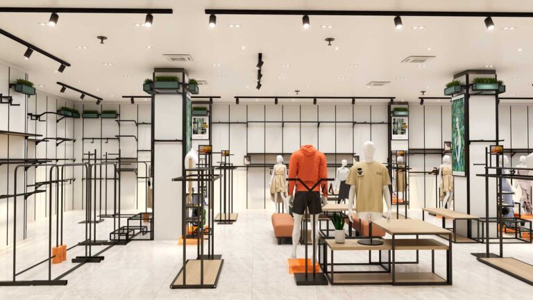
Modern fashion apparel store interior design by BDF Display — a complete retail fit-out project combining custom clothing racks, display tables, and lighting design. Project
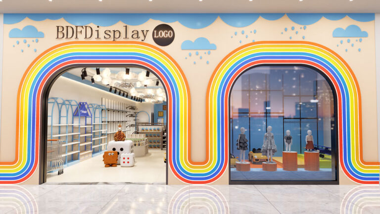
Kids Clothing Store Interior Design Kids clothing store interior design by BDF Display — a bright, child-friendly retail fit-out project combining low-height fixtures, safety-focused displays,
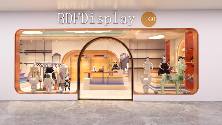
Modern kids clothing store interior design project — a full-store renovation for a children’s fashion brand expanding to a 1,000 sq ft retail location. Project
Mom and baby store interior design — a specialty retail space designed for new and expecting mothers, featuring nursery displays, feeding areas, and comfortable browsing
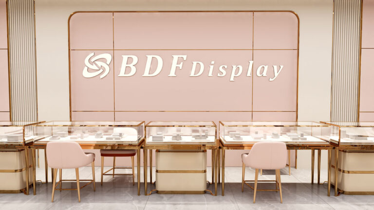
We provide free 3D luxury jewelry store design service for high-end jewellery boutiques, fashion accessory shops and luxury retail stores. Our professional design team focuses
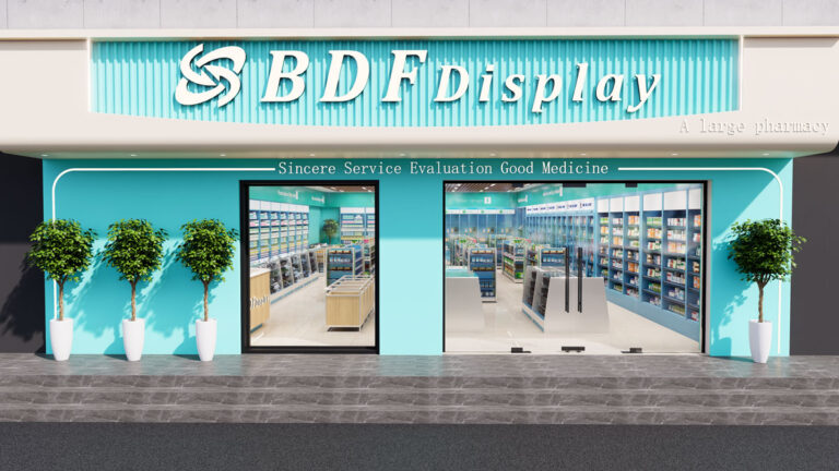
We provide professional free 3D pharmacy store design service for retail drugstores, medical retail shops, and community pharmacies worldwide. Our design team focuses on standardized,
Fill out the form below and we’ll get back to you within 24 hours with a detailed quote or proposal.

+8613710863392
sales@biaodefu.net
Scan the QR code or click the button below to chat with us directly on WhatsApp. Faster response, real-time communication.
Perfect for: