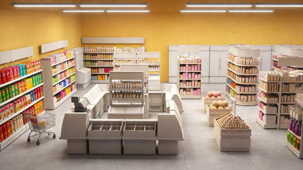
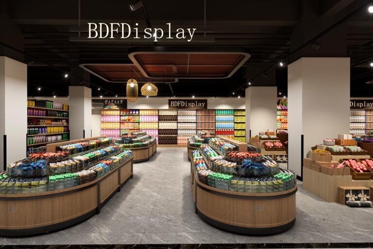
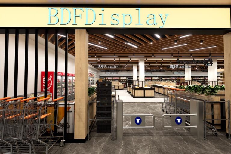
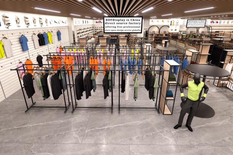
1500㎡ Large Lifestyle Grocery Store Design & Free 3D Layout
large grocery supermarket layout, daily goods retail store design, heavy-duty supermarket shelving, full-category lifestyle store planning

large grocery supermarket layout, daily goods retail store design, heavy-duty supermarket shelving, full-category lifestyle store planning
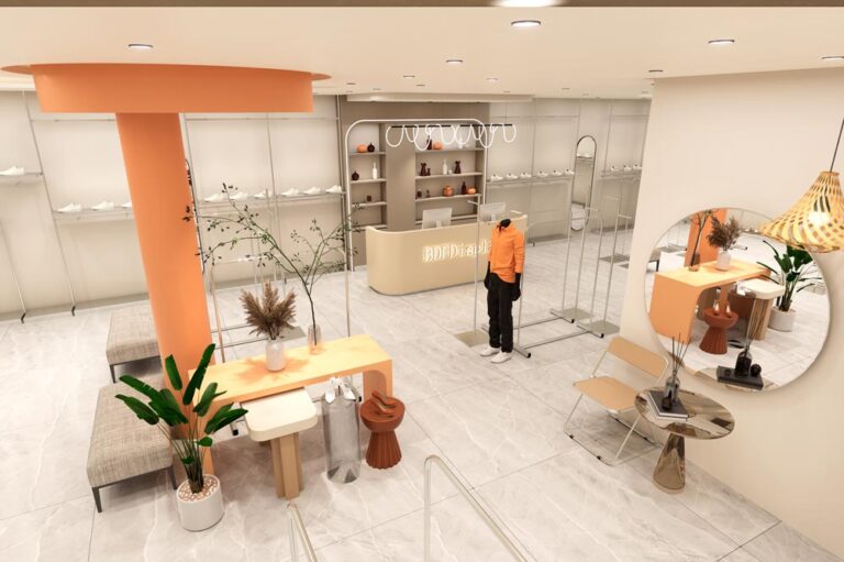
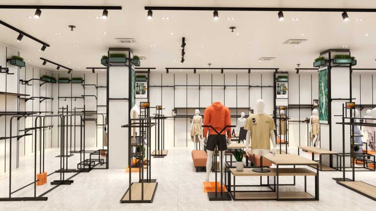
Modern fashion apparel store interior design by BDF Display — a complete retail fit-out project combining custom clothing racks, display tables, and lighting design. Project
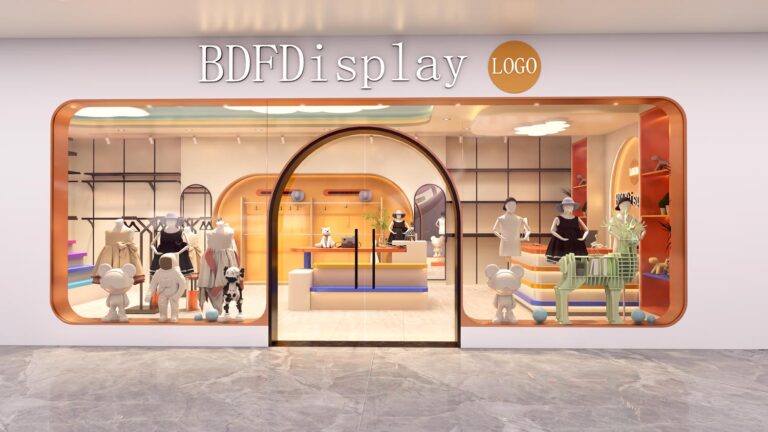
Kids Clothing Store Interior Design Kids clothing store interior design by BDF Display — a bright, child-friendly retail fit-out project combining low-height fixtures, safety-focused displays,
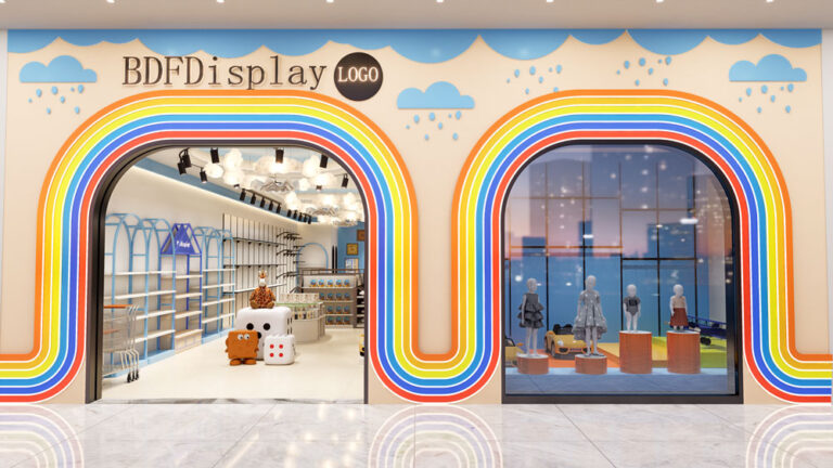
Modern kids clothing store interior design project — a full-store renovation for a children’s fashion brand expanding to a 1,000 sq ft retail location. Project
Mom and baby store interior design — a specialty retail space designed for new and expecting mothers, featuring nursery displays, feeding areas, and comfortable browsing
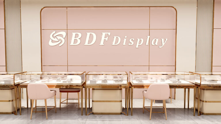
We provide free 3D luxury jewelry store design service for high-end jewellery boutiques, fashion accessory shops and luxury retail stores. Our professional design team focuses
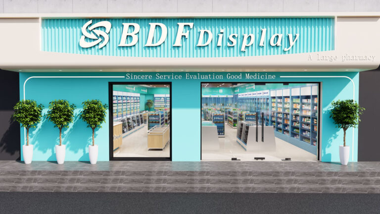
We provide professional free 3D pharmacy store design service for retail drugstores, medical retail shops, and community pharmacies worldwide. Our design team focuses on standardized,