

Introduction
Let’s get real for a second — in retail, space literally equals money. And if you’re running a small grocery store, every single square foot counts.
Now, 1,500 square feet (about 139 square meters) might sound limiting. But here’s the thing: I’ve seen stores half that size outperform bigger competitors simply because they used their space smarter.
This guide is about helping you do the same. Whether you’re opening a new store or trying to squeeze more value out of your existing space, these strategies have been tested and proven. The goal? Create a shopping environment that’s efficient, comfortable, and most importantly — profitable.
1. Understanding Your 1,500 Square Foot Space
Space Allocation Breakdown
Here’s how I’d recommend dividing your space:
| Area | Square Feet | Percentage |
|---|---|---|
| Sales Floor | 1,000-1,100 sq ft | 67-73% |
| Storage/Backroom | 200-250 sq ft | 13-17% |
| Employee Area | 100-150 sq ft | 7-10% |
| Customer Service | 50-100 sq ft | 3-7% |
Key Dimensions to Keep in Mind
- Main aisles: Minimum 4-5 feet (1.2-1.5 meters) — don’t go narrower
- Secondary aisles: 3-4 feet (0.9-1.2 meters)
- Shelf height: 5-6 feet (1.5-1.8 meters) — anything taller feels oppressive
- Checkout area: 8-10 feet wide (2.4-3 meters) for comfortable queuing
Traffic Flow Expectations
- Peak hour traffic: 50-100 customers per hour
- Shopping carts: 10-15 carts should be enough
- Shopping baskets: 20-30 baskets
- Checkout queue space: Plan for 5-8 customers waiting
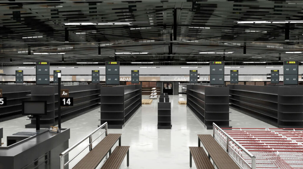
2. Choosing the Right Layout Type
Grid Layout — My Top Pick for 1,500 Sq Ft
Why it works:
Maximizes shelf space (critical when space is tight)
Customers already know how to navigate it
Makes inventory management way easier
Clear product categorization
How to implement:
Create 4-6 parallel aisles
Adjust aisle width based on your expected traffic
Use end caps for promotions
Make sure section signs are clear and visible
Honest take: This isn’t the most exciting layout, but for a small grocery store, it’s the most practical. Customers can find what they need quickly, and you can fit more products.
Loop Layout — For Experience-Focused Stores
Why it works:
Guides customers past all your merchandise
Creates a natural shopping flow
Increases product exposure
Boosts impulse purchases
How to implement:
Design a single circular path
Place products on both sides of the path
Use center area for featured displays
Make the start and end points obvious
When to consider: If you’re more of a specialty store than a traditional grocery, this could work well. But be careful — some customers just want to grab what they need and go.
Free-Flow Layout — For Specialty Food Stores
Why it works:
Flexible product displays
Creates an exploration feeling
Works well with irregular spaces
Increases customer engagement
How to implement:
Use island-style displays
Provide clear visual guidance
Ensure plenty of movement space
Group products strategically
My advice: This requires more skill to execute well. If you’re new to retail, I’d start with grid and evolve from there.
3. Strategies to Maximize Every Square Foot
Use Vertical Space Wisely
Shelf Design Strategy:
Height optimization: Go with 5-6 foot shelves. The space above can be used for storage or decoration
Multi-level displays: Use stepped shelving to increase display surface
Hanging systems: Suspend lightweight items or decorations from the ceiling
Wall utilization: Install wall-mounted shelves and displays
Specific Implementation:
| Area | Recommendation |
|---|---|
| Dry goods | 6-foot shelves, 3-4 levels |
| Refrigerated section | Custom height to match ceiling |
| Checkout area | Hang small items or promotions above |
| Entrance | Wall displays for seasonal products |
Pro tip: Don’t stack things too high though. If customers can’t reach it safely, they won’t buy it.
Design for Multiple Functions
Double-Duty Spaces:
Checkout + service counter: Combine customer service functions
Under-shelf storage: Use space beneath shelves for backup stock
Mobile display units: Movable displays that adapt to changing needs
Foldable furniture: Tables and chairs that fold away when not needed
Creative Solutions Worth Considering:
Adjustable height display platforms
Rotating shelf systems (great for corners)
Modular display units you can reconfigure
Hidden storage solutions that don’t look like storage
Smart Inventory Management
Reduce Storage Space Needs:
Just-in-time restocking: Keep less backup inventory
Direct vendor delivery: Some products go straight to shelves
Efficient warehouse design: Use vertical storage systems
Optimize turnover: Prioritize fast-moving products
Storage Room Design:
Area: 200-250 square feet (don’t go smaller)
Height: Use full vertical space
Organization: Clear categorization and labeling
Access: Easy paths for staff to move through
Real talk: I’ve seen stores cut storage to 10% to gain sales space. They always regret it. You need room to breathe in the back.
4. Product Display and Zoning Strategy
Entrance Area (50-75 Square Feet)
Goal: Create a great first impression and guide traffic
Decompression zone: 3-5 meters of open space — let customers adjust when they walk in
Visual focal point: Seasonal promotions or high-margin items
Shopping tools: Cart and basket station
Information point: Store map, current promotions
What I’ve learned: Don’t put too much right at the entrance. Customers need a moment to transition from “outside mode” to “shopping mode.”
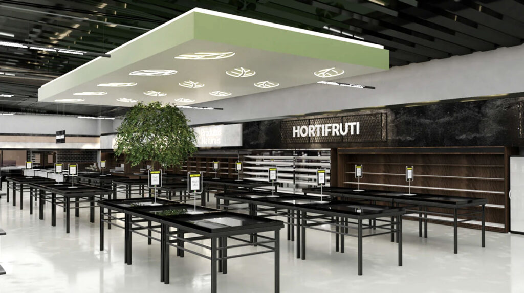
Fresh Produce Section (200-250 Square Feet)
Location: Near entrance or on the right (people naturally turn right)
Product grouping: Keep fruits, vegetables, and refrigerated items separate
Display techniques: Use stepped displays to create abundance
Lighting design: Professional produce lighting enhances freshness
Temperature control: Proper refrigeration and humidity systems
Important: This section creates your store’s overall impression. If produce looks fresh, customers assume everything else does too.
Dry Goods Section (300-350 Square Feet)
Layout: Grid pattern with 4-5 aisles
Product categorization: Clear category signage
Shelf management: Best-sellers at eye level
Promotion placement: End caps and aisle entrances
Restocking system: Replenish from behind, keep front tidy
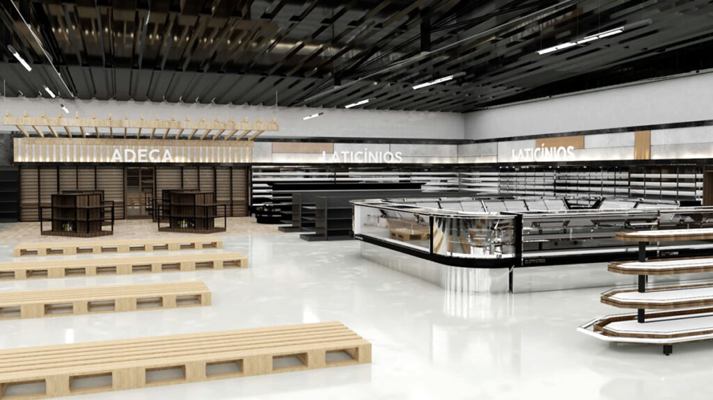
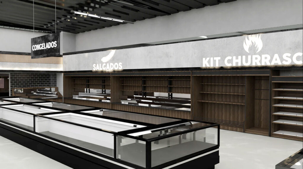
Refrigerated & Frozen Section (150-200 Square Feet)
Design Considerations:
Energy efficiency: Invest in efficient refrigeration equipment
Accessibility: Easy for customers to reach products
Organization: Clear temperature zone markings
Safety: Non-slip flooring and adequate lighting
Money-saving tip: Good refrigeration costs more upfront but saves significantly on electricity. Don’t cheap out here.
Checkout & Service Area (100-125 Square Feet)
Integrated Functions:
Checkout counters: 2-3 positions depending on traffic
Service desk: Customer service, packaging, special requests
Impulse purchase zone: Small items and candy near register
Queue management: Clear queuing area with defined space
5. Optimizing Customer Flow
Natural Flow Guidance
Right-turn tendency: Place high-demand items on the right side
Visual guidance: Use colors, lighting, and signage to direct movement
Path design: Avoid dead ends and bottlenecks
Traffic monitoring: Watch and optimize customer paths regularly
Something to watch: Stand near your entrance for an hour during peak time. You’ll learn more about flow than any consultant can tell you.
Peak Hour Management
Aisle width: Main aisles 4-5 feet, secondary 3-4 feet
Queue system: Clear queue signage and dedicated space
Staff scheduling: Add staff during peak hours
Contingency plan: Have a plan for when it gets crowded
Accessibility Design
Aisle width: Meet wheelchair accessibility requirements
Shelf height: Consider customers of different heights
Clear signage: Large fonts, high contrast
Assistive devices: Provide shopping assistance tools
Honest note: Accessibility isn’t just about compliance. It’s about welcoming everyone. Plus, you never know when you or a family member might need those accommodations.
6. Lighting and Atmosphere Design
Functional Lighting
| Area | Lighting Type |
|---|---|
| Produce section | High CRI LED lighting |
| Aisles | Even base lighting |
| Feature areas | Spotlights for highlighted products |
| Checkout area | Adequate work lighting |
Creating the Right Atmosphere
Color temperature: 3000-4000K creates a warm, welcoming feel
Lighting layers: Base lighting + accent lighting + decorative lighting
Natural light: Maximize window where possible
Energy efficiency: LED lighting and motion sensors
What works: Warmer light makes people stay longer. Cooler light makes things look clean but can feel clinical. Find your balance.
Sensory Experience
Visual: Clean, bright, organized
Auditory: Moderate background music (not too loud)
Olfactory: Fresh food aromas (especially bakery if you have one)
Tactile: Comfortable temperature and humidity
Quick observation: I’ve walked into stores that smelled like old cardboard. Don’t let that be you. Fresh smells = fresh food in customers’ minds.
7. Cost Control Strategies
Optimizing Initial Investment
Shelf selection: Cost-effective modular systems
Equipment purchasing: Energy-efficient used or refurbished equipment
Renovation materials: Durable and easy-to-maintain materials
Phased implementation: Complete renovation and equipment in stages
My recommendation: Don’t try to do everything at once if budget is tight. Phase 1: essential fixtures. Phase 2: nice-to-haves. Phase 3: upgrades.
Managing Operating Costs
Energy efficiency: LED lighting and high-efficiency equipment
Maintenance plan: Preventive maintenance reduces repair costs
Inventory optimization: Reduce slow-moving and expired products
Labor efficiency: Optimize staff scheduling and tasks
Maximizing Return on Investment
High-margin areas: Prioritize investment in high-return zones
Test and adjust: Test new layouts on a small scale first
Data-driven: Optimize layout based on sales data
Continuous improvement: Regular evaluation and adjustment
Reality check: Track your cost per square foot. If a section isn’t pulling its weight after 3 months, something needs to change.
8. Implementation Timeline
Planning Phase (1-2 Months)
Market research and positioning
Space measurement and analysis
Preliminary layout design
Budget development and approval
Design Phase (1 Month)
Detailed layout design
Equipment selection and procurement
Renovation design
Vendor selection
Implementation Phase (1-2 Months)
Space preparation and renovation
Equipment installation
Shelf and display installation
System setup and testing
Optimization Phase (Ongoing)
Post-opening monitoring and adjustment
Customer feedback collection
Sales data analysis
Continuous improvement implementation
Time-saving tip: Overlap phases where possible. While renovation is happening, you can be training staff and setting up systems.
9. Common Mistakes and How to Avoid Them
Space Planning Mistakes
| Mistake | Solution |
|---|---|
| Aisles too narrow | Keep minimum 4 feet for main aisles |
| Insufficient storage | Allocate at least 15% for backroom |
| Poor traffic flow | Map out customer paths before finalizing |
| Ignoring expansion | Leave some flexibility for future changes |
Product Display Mistakes
| Mistake | Solution |
|---|---|
| Confusing categorization | Clear category and signage system |
| Poor placement of high-demand items | Put best-sellers in high-traffic areas |
| Overcrowded shelves | Leave breathing room between products |
| Ignoring eye-level | Prime real estate goes to high-margin items |
Technology Mistakes
| Mistake | Solution |
|---|---|
| Over-investing in complex tech | Choose simple, necessary technology |
| Ignoring staff training | Comprehensive technology training plan |
| No backup plan | Have manual processes ready if tech fails |
Customer Experience Mistakes
| Mistake | Solution |
|---|---|
| Ignoring accessibility needs | ADA-compliant accessible design |
| Crowded and uncomfortable | Adequate personal space and comfortable environment |
| Poor signage | Invest in clear, visible signs |
| No feedback system | Create ways to hear from customers |
Final Thoughts
Look, I’ll be straight with you — 1,500 square feet isn’t a lot of space. But I’ve also seen some incredible stores make it work brilliantly.
The key isn’t having more space. It’s using what you have smarter.
A successful small grocery store layout balances multiple factors: customer experience, operational efficiency, product display, and cost control. It’s not about copying what the big chains do. It’s about understanding your specific customers and designing for them.