

If you’ve worked in a retail store for a while, you must be aware of an awkward reality: with the same products and similar prices, some stores just sell better, while others struggle to move merchandise. More often than not, it’s not that the products are bad, but that customers “don’t see them,” “don’t understand them,” “don’t bother choosing them,” or “don’t think they’re worth it”—and then they leave. Simply put, display is all about solving these four problems: making products visible, understandable, easy to choose, and desirable.
Below, I’ll break down the most practical and actionable display techniques for 2026 in great detail. The content will be quite conversational, like listening to someone with store experience sharing insights—no tedious academic jargon or rigid formatting. You can read it while comparing it to your own store. Many changes don’t cost much; the key is to have the right mindset.
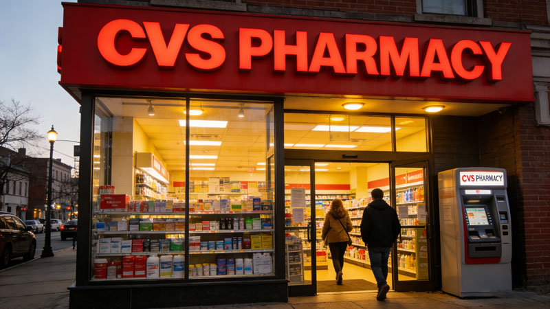
1. Treat the Entrance as the “Homepage of Your Store”—Stop Using It as a Temporary Storage Area
Many people underestimate the value of the entrance. Think about your own shopping experience: in the first few seconds when you walk in, you subconsciously judge, “Is this store easy to navigate? Do they have what I want? Is it worth walking further?” The entrance display is the answer to this judgment.
I’ve seen many stores where the entrance is either cluttered with promotional odds and ends like a temporary warehouse, or nicely arranged but with no clear focus on what’s being promoted. By 2026, I recommend using a stable structure for entrance displays: One Theme + One Star Product + One Solution.
The theme should ideally be related to seasons, holidays, or local lifestyle scenarios. For example, in summer, don’t forcefully promote hot pot base; instead, promote “barbecue supplies, cold drinks, cold dishes, camping gear, and mosquito repellent.” When customers see this, they’ll think, “Yes, I need these things this season.”
The star product is the item you most want to sell—it could be a new product, a high-margin item, or a best-selling SKU you can offer at a competitive price. The key is to place it at the visual center so customers can lock onto it at a glance.
The solution part is particularly important because customers nowadays like to save mental effort. Don’t just display a bunch of products; go the extra mile to tell them “how to buy more conveniently.” For example, if you’re doing a “10-Minute Dinner” theme, display pasta, sauce, cheese, salad, and drinks together, with a small sign next to them that says “Grab and Go.” Customers will feel like you understand them.
Here’s a small detail about the entrance: don’t overcrowd it. Many owners like to fill the entrance, thinking “more goods make the store look busy.” But to customers, it looks messy, oppressive, and low-end. Leaving some space and creating layers will make it feel more “curated,” and customers will be more willing to stop.
Additionally, don’t let too much time pass between entrance updates. You don’t need to change it every day, but if you can update the theme every 3-4 weeks or so, regular customers will feel like there’s always something new, and they’ll be more willing to look around when they walk in.
2. Don’t Only Focus on the Entrance for Terminal Areas—The Checkout Counter Is Actually Your Last “Profit-Grabbing Spot”
Many people only talk about shelves and end caps when discussing displays, but the checkout area really shouldn’t be ignored. Because when customers are checking out, their mental state is special: they’ve already decided to pay, and they’re more receptive to “adding one more small item”—especially if it’s cheap, convenient, and requires no thought. This is where impulse purchases are most likely to happen.
By 2026, I recommend transforming the checkout area into a “smart add-on zone” rather than a pile of candy and miscellaneous items.
What’s suitable for the checkout area? You can remember a few keywords: small, cheap, easy to understand, forgotten item reminders, and low decision-making effort.
Small snacks are still classic, such as gum, chocolate, and small packs of nuts—but don’t rely solely on these.
Forgotten item reminders are actually more effective, such as batteries, wet wipes, band-aids, disposable rain ponchos, lighters, small packs of seasonings, and travel-sized hand sanitizer. When customers see these, they’ll think, “Oh right, I need this,” and it’s easy for them to add to their purchase.
Scenario-based small items also work well. For example, before the weekend, display small barbecue seasonings and disposable tableware; in winter, display warm patches; in rainy seasons, display umbrella sleeves or waterproof bags.
Another valuable point about the checkout area: the queuing path. Don’t cram all products on the counter; instead, let customers “naturally pass by” some small shelves while waiting in line, giving them time to grab something casually. If you design the queuing path well, add-on purchases at the checkout will be steady.
Digitalization is also suitable for the checkout area. For example, a small screen scrolling “Today’s Add-On Price,” “Buy One Get One Free,” or “Member +1 Yuan Redemption.” This kind of information is easier to notice than static posters, and you can update the content quickly.
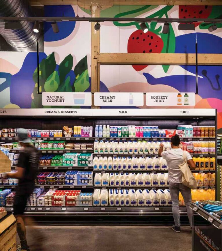
3. By 2026, the Core of Shelf Display Won’t Be “Neat Arrangement”—But “Making Customers Understand at a Glance”
Many stores have neatly arranged shelves but only average sales. The reason is usually not that the shelves are untidy, but that customers “can’t understand how you’ve organized them.” When customers are in the aisle, they don’t read labels carefully like they’re taking an exam—they just scan. What you need to do is make them understand in 1-2 seconds: what area this is, which products are suitable for them, what the differences are, and how to buy the most cost-effectively.
The most important basic principle here is still the old saying: eye level is buy level. Place the SKUs you most want to promote at eye level, and the change in sales will usually be noticeable. You can allocate eye-level space based on your goals:
If you want to boost margins, put high-margin products at eye level;
If you want to emphasize cost-effectiveness, put private label products at eye level;
If you want to reduce customers’ time searching for products, put the best-selling items at eye level.
I also highly recommend changing from “long horizontal rows” to more vertical sections. The advantage of vertical display is that customers can find brands faster. For example, arranging the same brand in a vertical column from top to bottom—customers can see at a glance that the brand is in this column, and to find large or small sizes, they just need to scan up or down instead of left and right for a long time.
Another practical point: don’t overfill the shelves. Full shelves are friendly to staff but unfriendly to customers. Customers will feel oppressed, find it hard to choose, and be afraid of knocking things over when taking products. Proper blank space will make key products stand out more and make it easier to keep the shelves tidy.
By the way, many stores overlook “product orientation.” Packaging not facing forward, unclear price tags, or brands being obscured—these small details will directly affect conversion. If customers can’t see the products clearly, the shelf space you paid for is equivalent to being unused.
4. By 2026, End-Caps Will Be “Advertising Spaces” in Stores—Don’t Use Them as Regular Shelves
Why are end-caps valuable? Because they are the first thing customers see when they reach the aisle entrance, not the inside of the aisle. Essentially, end-caps are one of the largest exposure spots you can “buy” in your store.
But the most common way end-caps fail is consistent: too many SKUs, unclear themes, and looking like clearance areas. Customers won’t see them as recommendations—just as a pile of miscellaneous goods.
By 2026, the more recommended approach for end-caps is: Single Theme + Few SKUs + Strong Information.
A single theme means “this end-cap only tells one story,” such as “Weekend Hot Pot,” “Healthy Breakfast,” “Summer Cold Drinks,” or “Buy One Get One Free Zone.” Don’t have laundry detergent, biscuits, toys, and toothpaste on the same end-cap—you won’t be able to tell a coherent story.
Few SKUs doesn’t mean putting few products; it means being selective. The more curated the end-cap, the more willing customers are to stop. You can have deep inventory, but don’t spread out the SKUs too much.
Strong information means letting customers understand the value in one second: how much they can save, how long the offer is limited, and why it’s worth buying. The information on end-caps should preferably be “large fonts + short sentences”—no long paragraphs.
End-caps are usually most suitable for: seasonal promotions, high-margin key products, new products, discounts, combo packs, and private label brands. If you have a chain store, end-caps are also the easiest place to implement standardization for results because the location is fixed, replicable, and trackable.
5. By 2026, Cross-Merchandising Should Upgrade from “Placing Together” to “Providing Scenario Solutions”
Many people do a bit of cross-merchandising—the most basic form is placing complementary products together, such as dip next to chips, pasta sauce next to pasta, or jam next to bread. This is definitely effective because it reminds customers “you might also need this.”
But by 2026, if you want to achieve greater incremental growth with cross-merchandising, don’t stop at “placing complementary products together”—start offering “scenario solutions,” which means packaging the solutions to customers’ problems.
For example, set up a small “Taco Tuesday” station with tortillas, beef/bean puree, cheese, salsa, sour cream, and tortilla chips, and put a sign next to it that says “Grab and Go, Ready in 10 Minutes.” When customers see this, they’ll think “this is so convenient,” and it’s easy for them to take the whole set.
Another example is “Date Night”—display pasta, sauce, cheese, red wine, candles, or small desserts. This kind of combination not only increases the average transaction value but also enhances the “fun factor” of the store. Many people are actually willing to pay for “having things thought out for them.”
A particularly practical carrier for cross-merchandising is sidekicks (also called power wings). Hang them on the side of end-caps or at the entrance of aisles, specifically for small “easily forgotten” accessories—such as coffee filters and sugar packets in the coffee area, or baking paper and scrapers in the baking area. You’ll find that these add-on purchases are very stable because it’s not that customers don’t want to buy them; they just can’t remember them.
6. “Rotating Hot Spots” Is the Cheapest Way to Combat Aesthetic Fatigue in 2026
The biggest problem for many stores is that customers feel a lack of freshness. Especially for community stores and convenience stores with a fixed customer base—people come several times a week. If your displays don’t change for three months, regular customers will automatically ignore them, and sales will gradually stagnate.
So I highly recommend setting up “rotating hot spots.” You can think of it as fixing a few locations that “change themes every week,” such as a display stack in the main aisle, an end-cap, or an island counter on the right side of the entrance. You don’t need to change the entire store—just keep rotating these few spots, and customers will feel like there’s always something new to discover each time they come.
Rotating hot spots are suitable for: new products, internet-famous items, seasonal limited editions, short-term promotions, member-exclusive products, and tasting themes. Their value is not just selling goods, but making the store feel like a “constantly updating” place.
7. By 2026, Lighting and Signage Will Be More Like “Low-Cost Conversion Tools”—Not Decoration Details
In many stores, lighting and signage are regarded as decoration issues, but they actually directly affect purchasing decisions. Think about it: if a product is placed in a dark corner, no matter how good it is, customers can’t see it clearly; if a promotional sign is too small or the information is confusing, customers won’t bother to understand it.
By 2026, I recommend treating lighting as a “traffic guidance tool.” Use lighting to brighten key areas, and customers will naturally walk there. You can also use spotlights to highlight new products, end-cap themes, and tasting stations. Don’t let your store have “dead corners”—dead corners are sales black holes.
For signage, I advocate “fewer but clearer.” Don’t cover the store with signs; customers will experience visual fatigue. Make key signs large enough, short enough, and straightforward enough, such as:
“Must-Buy This Week”
“Limited 3 Days”
“Second Item Half Price”
“10-Minute Dinner”
“Better Value When Stocking Up (Lower Cost Per Serving)”
Another point many stores overlook: prices must be clear. When customers can’t find the price, the most common reaction is not to ask the staff, but to put the product back directly. Especially for non-essential items, unclear prices will directly reduce conversion.
8. Digital Displays: In 2026, It’s Not About “Big Screens”—But “Faster Iteration, Fewer Errors, and Better Explanations”
When it comes to digitalization, many people’s first reaction is “we don’t have the budget.” In fact, by 2026, the most common and effective digitalization that can truly improve efficiency is not flashy big screens, but these more practical things:
Digital Price Tags: Their value is not about being high-end, but about reducing price errors, enabling quick promotion changes, and eliminating the need for staff to change paper price tags every day.
Small Digital Screens: Place them at the entrance or checkout area to display daily promotions, member benefits, and combo recommendations—especially suitable for “information updates.”
QR Codes: Link to recipes, usage tutorials, origin stories, and member discounts. The reason for letting customers scan QR codes is not to show off technology, but to let them understand “how to use it and whether it’s worth it” faster.
If you have a membership system, a more worthwhile attempt in 2026 is “lightweight personalization.” For example, display different themes on the screen at different times: breakfast combos in the morning, bento solutions at noon, and dinner sets in the evening. You don’t need to be as precise as the internet, but as long as it’s more in line with the current scenario than before, the effect will be better than “the same poster all day.”
9. Sustainable Displays Will Become More Like a “Basic Requirement” in 2026—Not Doing It Will Make You Seem Unprofessional
Sustainability is not just a slogan; the key is to make it visible to customers. You can do it simply, but you must do it authentically.
For example, use recyclable materials for display shelves and clearly state “recyclable paper/eco-certified” on the signs. Set up a local supplier area and clearly tell the origin, transportation distance, and farm stories. Create a zero-waste bulk section with clear hygiene standards, usage methods, and price units. Set up a near-expiry discount area and keep it tidy and organized, making customers feel that this is a “smart way to reduce waste” rather than a “messy clearance.”
Behind sustainability is trust. Customers will think you are more responsible and be more willing to buy from you—or at least more willing to see your store as a “long-term go-to.”
10. Measuring Display Effectiveness: In 2026, Stop Asking “Is It Displayed?”—Start Asking “Is It Worth Displaying?”
The worst thing about displays is working hard for a long time without being able to clearly tell if they’re effective. By 2026, I recommend establishing at least a minimal data loop—it doesn’t need to be complex, but it should allow for review.
You can start with these metrics:
Sales Lift: Comparison before and after display (comparing the same period and day of the week is fairer)
Cross-purchase Rate: After launching combos, have related categories increased together?
Stockout and Replenishment Pressure: Selling fast is a good thing, but if you’re always out of stock, the display will be in vain.
Turnover Rate: Especially for fresh produce and short-shelf-life products, can displays help sell them faster?
ROI: Estimate using “incremental net profit / display cost”—even a rough estimate is instructive.
Here’s a practical approach: First, select an end-cap for a pilot test and run it for two weeks. Compare the sales of these two weeks with the previous two weeks, and see if associated products have increased. If it’s effective, replicate it to the next end-cap; if not, change the theme, SKUs, or copy. After 3 rounds of iteration, your store’s displays will improve significantly.
11. Don’t Renovate the Entire Store at Once—In 2026, the “Pilot-Review-Replicate” Rhythm Is More Popular
You really don’t need to tear down and rebuild the entire store from the start. A smarter approach is to treat the store as a continuously optimizable system: first test on the most certain and easiest-to-see-results points, get positive feedback, then expand to a larger scope. This way, staff won’t be overwhelmed, and you’ll be more likely to prove that “displays can generate revenue.”
A relatively stable rhythm is as follows:
Week 1: Select Location + Choose Theme
For example, choose an end-cap with the theme “10-Minute Dinner.” Then select SKUs around “quick dinners”: pasta, pasta sauce, canned tomatoes, cheese, ready-to-eat salad, and sparkling water. You don’t need many SKUs, but they should clearly convey “grab these and you’re ready to eat.”
Weeks 2-3: Stable Execution + Observation
Focus on three things: Are the products selling? Do customers pick them up and put them back? Are there frequent stockouts? You can also ask staff: Do customers ask “what’s this promotion” or “how to buy this combo”?
Week 4: Review Data + Adjust
Use POS data to check the sales changes of these SKUs, especially whether previously slow-selling items have been driven. If sales have increased but you’re out of stock every day, it means the theme is effective but replenishment can’t keep up; if sales haven’t moved, consider whether the theme is wrong, the SKUs are inappropriate, the signage is unclear, or the location is not good enough.
Starting from Week 5: Replicate to a Second Location
For example, if you’ve successfully tested the “quick dinner” end-cap, move to another end-cap with “weekend breakfast.” This way, you won’t disrupt the store all at once, but you’ll continue to get better.
Another advantage of this rhythm: staff will become more proficient. You’ll find that at first, everyone thinks displays are “extra work,” but when they see that end-caps actually sell fast and the replenishment rhythm is clearer, they’ll instead feel “this is more convenient.”
12. By 2026, Store Layout Will Affect Sales More Than You Think
Many people only talk about “what to display” when discussing displays, but layout actually determines “what customers can see.” If the layout naturally makes customers only visit half the store, no matter how good your displays are, they won’t work.
There are several common layout ideas—you don’t need to memorize the concepts, but you should understand their “customer flow patterns”:
Grid Layout: Straight aisles like in supermarkets and pharmacies. Advantages: high efficiency and easy product finding. Disadvantages: easy to get boring. So this type of store must rely on end-caps, display stacks, and hot spots to create “stopping points.”
Loop/Racetrack Layout: Let customers walk in a circle and naturally see most areas. Advantages: more complete exposure. Disadvantages: if the flow is too forced, customers will feel “compelled to walk.” Use “theme areas” and “rest/stopping points” to make it more comfortable.
Free-Flow Layout: More free flow like in boutiques and lifestyle stores. Advantages: strong experience. Disadvantages: more difficult to manage and replenish. But this type of store is particularly suitable for “storytelling displays,” and customers are willing to look around slowly.
By 2026, a practical principle is: let customers have a “natural path” in the store, but constantly encounter “small surprises.”
The path solves the problem of “not getting lost or tired”; the surprises solve the problem of “willing to stop and buy more.”
If your store has a grid layout, your surprises are end-caps, sidekicks at aisle entrances, and main aisle display stacks; if it’s a free-flow layout, your surprises are theme tables, windows, and display combinations of different heights.
13. The Concept of “Push Products” and “Pull Products” Must Be Used in 2026
I like a simple way of putting it: some products are what you want customers to see first, and some are what customers will actively look for.
Push Products: New products, seasonal products, high-margin products, and products you want to grow.
Place these at the entrance, eye level, end-caps, and hot spots—in short, places where “customers can see them without looking.”
Pull Products: Necessities, frequently purchased items, and products customers have clear goals for.
Items like milk, eggs, staple grains, and tissues—customers will look for these anyway. Instead, place them deeper in the store, making customers pass by more categories on their way to these necessities, thereby increasing exposure and casual add-on purchases.
This idea may sound like a “tactic,” but it’s actually a very classic logic in retail: use customers’ “must-buy” items to drive them to see more “unplanned purchases.”
By 2026, the key point is: customers have less patience, so Push Products must be “easier to understand quickly.” You place Push Products at the entrance, but if the signs read like instruction manuals, customers still won’t look. The expression of Push Products should be more like short video titles: short, straightforward, and able to convey value immediately.
14. By 2026, “Less Is More” Displays Will Be More Popular—Customers Don’t Want to Face Choice Fatigue
In the past, you might have thought “the more goods, the better,” but now customers are actually prone to choice fatigue. Especially when facing a whole wall of similar products, many people will directly avoid making a decision and end up buying something familiar or nothing at all.
So you’ll find that many stores with good sales are actually more “curated”:
It’s not that they have fewer SKUs, but that the display surface is more rhythmic and focused.
A practical approach is to create a “3-Tier Structure” in each category:
Tier 1: Star/Best-Selling Products (items customers can choose without thinking)
Place at eye level with clear signage, telling customers “this is the safest choice.”
Tier 2: Differentiated/Upgraded Products (to boost margins)
Place next to best-sellers with a short sentence explaining “why it’s more expensive.” For example, “organic/sugar-free/high-protein/imported origin.”
Tier 3: Cost-Effective Alternatives (to retain price-sensitive customers)
Place at a slightly lower position, giving price-sensitive customers an option so they don’t leave empty-handed because the price is too high.
This way, customers will feel “you’ve sorted it out for me,” making the choice easier and the purchase smoother.
15. Don’t Just Sell Products—Sell “Usage Methods,” Especially for Novel, Special, and High-Priced Products
Many special products don’t sell well not because they’re bad, but because customers don’t know how to use them or what to do with them after buying. By 2026, in-store displays should be more like “educational content,” especially suitable for the following:
New products, internet-famous items, snacks with strange flavors
Imported seasonings, special sauces
High-priced, unfamiliar brand products
Health products (sugar-free, low-fat, high-protein) that need explanation
You don’t need to make complex display boards—just do two things:
Tell customers in one sentence what problem it solves
For example, “This sauce is the key flavor for making Thai fried noodles.”
Provide the simplest usage scenario
For example, “Good for mixing with rice/noodles or dipping grilled meat.”
If you add a QR code linking to a 30-second video recipe, the conversion will be even more stable. Because once customers have the confidence that “I can use this,” the purchase threshold will be significantly lowered.
16. For Fresh Produce, Bakery, and Delicatessen Areas—By 2026, They’ll Rely More on “Visual Freshness”
If you run a grocery store/supermarket, the display of fresh produce is particularly crucial. Because it’s not only a profit center but also an area that instantly determines “whether the store is fresh.”
Here are some particularly practical points:
Don’t stack too high at once: Stacking fresh produce too high easily damages or bruises it, leading to greater waste, and customers taking items from the bottom layer can cause the stack to collapse.
A better way is to replenish and organize frequently, keeping it looking “just displayed.”
Use color for guidance: When there are many leafy greens, intersperse red, yellow, and orange items such as tomatoes, bell peppers, and oranges to make it look more abundant and vibrant.
“Looking clean” is more important than “looking abundant”: By 2026, customers will be more sensitive to hygiene and tidiness. If there are water stains, broken leaves, or rotten spots on the counter that aren’t cleaned up in time, customers will directly lose trust.
Offer “fresh produce solutions”: For example, combine salad greens, salad dressing, ready-to-eat chicken breast, and nuts into a small combo, telling customers “a salad in 3 minutes.” If the fresh produce area only displays vegetables, you’ll miss out on a lot of cross-selling opportunities.
The same applies to bakery and delicatessen areas. You want customers to feel “fresh, just baked, and ready to eat now”—lighting and aroma will also help a lot.
17. By 2026, “Seasonal Displays” Won’t Just Be Holiday Stacks—But a Full-Year Operational Plan
Many stores only set up seasonal displays two weeks before holidays and take them down immediately after. This can certainly drive sales, but by 2026, it’s more recommended to make seasonal displays a “full-year rhythm”—it will be more stable and less stressful.
You can simply divide the year into several major theme cycles, such as:
Spring: Light meals, outdoor activities, storage, cleaning
Summer: Cold drinks, barbecue, sun protection, mosquito repellent, camping
Autumn: Baking, warm tonics, back-to-school, home living
Winter: Hot pot, hot drinks, New Year’s goods, gift boxes
Divide each cycle into small nodes, such as Dragon Boat Festival, Mid-Autumn Festival, Halloween, Christmas, New Year, etc. You don’t need to go all out for every node, but you should at least ensure that there’s always a theme “relevant to the current time” rotating at the entrance, end-caps, and hot spots. Customers will feel that your store “keeps up with life”—this feeling is very valuable.
18. By 2026, “Value-Oriented Displays” Should Be More Conversational—Don’t Make Customers Calculate Themselves
When the economic environment is tight, customers pay more attention to “whether it’s cost-effective.” But many stores’ promotional expressions are too complex: a bunch of buy-one-get-one rules, unclear combo prices, and inconsistent price tags before and after discounts. When customers see how complicated it is, they give up.
So I recommend explaining value in a more “conversational” way:
“Weekly Breakfast Sorted (Less Than X Yuan Per Serving)”
“Save X Yuan Compared to Buying Separately”
“Family Pack Better Value (Lower Unit Price)”
“Alternative to Big Brands, Same Taste (Save X%)”
In particular, the promotion of private label brands will become more common by 2026. If you want to promote private label products, don’t just display them—help customers build confidence that “I won’t regret buying this.” Tastings, comparison price tags, best-selling signs, and simple selling point cards can all lower customers’ psychological threshold for trying them for the first time.
19. Maintenance and Replenishment: The True Test of a Display Is After Three Days—So You Need a “Daily Mechanism”
The biggest problem with displays is that “they look great when set up, but fall apart after a few days.” It’s not that you can’t arrange them; it’s that you don’t have a mechanism.
By 2026, I recommend creating a “Display Maintenance Checklist”—it doesn’t need to be long, but it should be fixed:
Before opening every day: The entrance, end-caps, and checkout area must be fully stocked, tidy, and with correct price tags.
Before peak hours every day: Replenish hot spots once to prevent stockouts during the busiest times.
After peak hours every day: Organize once, put messy items back in place, and fill empty spots.
Fixed day every week: Change end-cap themes or update materials—at least make customers feel “something has changed.”
Another particularly basic but important thing: First In, First Out (FIFO). Especially for food and short-shelf-life products, if you don’t adhere to FIFO, the better the display and the faster the sales, the easier it is to push new goods to the front and old goods to the back, eventually leading to waste.
20. Finally, Let’s Talk About “Common Pitfalls”—You Can Use This as a Self-Checklist
Many stores’ displays don’t boost sales, usually not because they didn’t do them, but because they stepped on these pitfalls:
Cluttered Entrance: Customers can’t understand what you’re promoting and ignore it directly.
End-Caps Like Clearance Areas: Too many SKUs, unclear themes, and customers don’t trust them.
Complex Promotional Information: Customers don’t want to calculate and give up directly.
Incorrect or Missing Price Tags: Customers put products back instead of asking.
Over-Stacking: Looks like there are many goods, but actually makes it harder to choose, harder to maintain, and causes more waste.
Frequent Stockouts: You display products but are often out of stock—poor customer experience and missed incremental sales.
No Updates for a Long Time: Regular customers develop “visual blind spots,” and your displays are equivalent to not being there.
No Data Review: Don’t know which displays are effective, and keep trial and error based on feeling.
If you avoid these pitfalls, your display effect will usually be pretty good.
Conclusion: 2026 Displays—Essentially About “Making Customers More Convenient, More Willing to Stop, and Easier to Buy More”
In the end, Retail Store Display Techniques 2026 are not a bunch of fancy props, but a set of strategies closer to customer behavior: customers have short attention spans, so your information should be short; customers don’t want to take detours, so your flow should be smooth; customers don’t want to calculate, so your value should be explained in conversational language; customers want to save mental effort, so you should provide scenario solutions.
If you want to start tomorrow, I’ll give you a practical starting order:
First, clarify the entrance theme (just one clear theme is enough).
Turn one end-cap into an “advertising space” (few SKUs + strong reasons to buy).
Create one scenario-based cross-merchandising display (such as quick dinners/weekend breakfasts).
Upgrade the checkout area from a “candy pile” to a “smart add-on zone.”
Review the data after two weeks and continue iterating.
If you want, you can also tell me your store type and categories (such as convenience store, boutique retail, supermarket, fresh produce store, beauty, mother and baby, etc.), as well as your store size, main customer base, and the current state of your entrance/end-caps/checkout area. I can customize a “2026 Display Renovation Plan” for you in the same style, including:
Entrance Theme Calendar (12 monthly themes for the whole year)
End-Cap Rotation Schedule (what to change weekly/every two weeks)
Cross-Merchandising Scenario List (ready to use directly)
Checkout Area Add-On Product Recommendations (tailored to your categories)
Minimum KPI and ROI Review Template
Just send me the information, and I can continue to make the plan more specific and actionable.